Reshaping our Local Advice Services offering
Published: by Matteo Remondini
As we described in a previous post**, a key finding of our initial** design research was the lack of clarity around Shelter’s service offering**. One of our aims is to simplify the experience for users seeking hel****p from Shelter. The Local Services redesign** has been a challenging – yet useful – project that has helped us move closer to this goal.
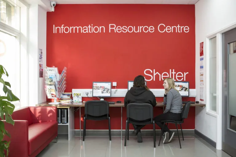
Last year we were asked to look at the part of our website dedicated to displaying information about our face-to-face services (F2F).
The problems
The old Advice Services Directory (ASD) had a number of problems that needed looking at, from pages not loading properly to interface functionality issues. It was clear we had to redesign it from scratch.
Along with technical problems, the content also needed attention. We were displaying a lot of information about third–party organisations – like local homelessness charities or Citizens Advice Bureau branches – without allowing users to filter these results. On top of which, we couldn’t ensure this third-party information was reliable or up-to-date.
Functionally, we also found that updating details about our services on this page proved a hard and slow process.
On top of the problems we were already aware of, we crucially needed to know how our users were experiencing this page, and how we could improve that.
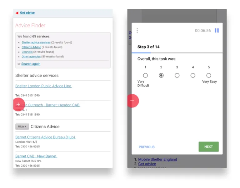
Screenshots of the old Advice Services Directory taken during a usability testing. Participant struggled to find the information he was after.
One of the main problems here was around naming conventions. Some users were unable to find their local Shelter services, because the way we referred to our F2F services were so varied and inconsistent. There was also a lack of shared understanding amongst our colleagues at Shelter of what our local services are, where they’re located, how many there are, and what they could – or couldn’t – help with for those in need.
Users were also finding it hard to access those pages because of difficulties in digital marketing/SEO. All of this resulted in outdated, incorrect information which was hard to find and often inconsistent. Not good for our users.
_‘_I’ve been working in the helpline for 9 years and I didn’t know we have a service in Oxford!__’
a Shelter adviser
Moving towards improvement
To determine what the most effective improvements would be, we needed to do more in-depth user research. We aimed to understand the context for people who need to talk to an advisor in person. We also aimed at validating the assumption that people were navigating these pages mainly to find out about Shelter’s local services – rather than all advice services of an area.
We observed and talked to people accessing our advice centres and our experts from several advice areas, to understand:
- Why do people prefer accessing F2F services? What are their emotional and practical needs?
- What information are they expecting to find? What are the most common queries?
- Are people who need our help also looking for 3rd party information?

What we found
The main needs are transactional. It’s important for people in need to rapidly get practical information, such as directions to local services, how access the help etc.
Users weren’t always being put first. Some of the content previously displayed on our ASD – like technical information about local specialist services – seemed important to stakeholders and commissioners, but less so to users.
Local hubs have their own resources and tools – for example, the third party offering in their local area. This information is often the most up-to-date available, and driven by real-life knowledge. As an example, a local Citizens Advice Bureau office was marked as open on the ASD, but in reality was about to close down. The local Shelter staff were aware of this, so didn’t signpost their clients to it because they knew its capacity was limited.
People in need of advice are often not in the position to be able to self-triage accurately**,** while our front-line experts can signpost them to the best place for their particular situation.
Initial solution
This research helped us prioritise features and the hierarchy of information, and alongside senior F2F stakeholders we co-designed an initial solution in the form of an interactive digital prototype.
We tested this low-resolution prototype with potential users and key stakeholders to ensure it would meet both users’ needs and business requirements.
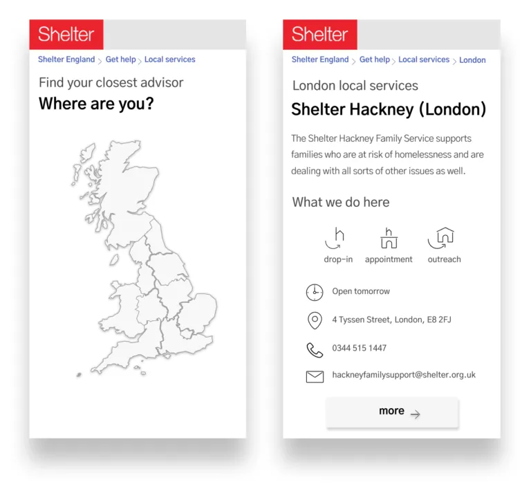
Two screenshots of the first low-resolution prototype we used to understand what of the initial solution we had in mind would’ve worked and what needed further refinement
The value of using a prototype
The early prototypes helped us focus on which areas worked well and which needed more work.
For example, by running remote usability testing we discovered that sometimes our users struggle to locate themselves on a map, and some old devices aren’t compatible with what was initially proposed as a solution. We agreed that a simple typographic list would be the clearest way to display our local services.
We also understood that some of the services that Shelter offers in London – the weekly advice sessions, as an example – can change constantly. To access any up–to–date information on where to go for help, it’s advisable for advice seekers to call a dedicated London’s Public Advice Line. We decided to explain this clearly on our website.
We could make changes quickly based on learnings.
By testing a disposable prototype with colleagues working on the front line, we were able to quickly apply these sorts of changes, and produce several incremental iterations of the product before building anything or publishing any web page.
Once the layout passed all tests, we collected all the necessary information we needed from local services, like their updated address, opening hours or offering, and eventually launched a pilot product.
How did the pilot perform**?**
After reviewing feedback and integrating changes, we released a second, stable version of our local services pages. The product met the goal of making it easier for users to find their nearest F2F service so they can get the help they need
By setting up a new database, we tidied up and standardised the fields containing local services information. Our team also created a visual interface and proposed a process for stakeholders to edit the information in complete autonomy.
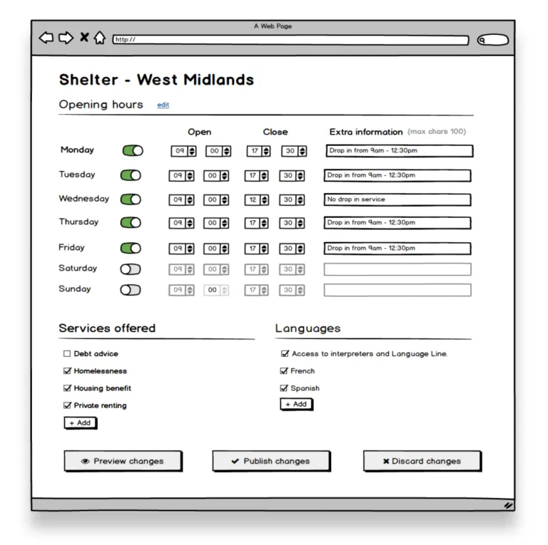
This mockup of how the admin interface would work helped communicating the idea to our colleagues responsible for Shelter’s local services offering.
This allows a quicker and more consistent update process, ensures long–term ease of maintenance, and helps to market our offering better – e.g. integrating with Google Maps to present our up-to-date information.
After reviewing how our users searched for our F2F services, we proposed a unified new naming system. We also moved on from ‘Advice Services Directory’ to ‘Local Services’ and went from 13 different bespoke names down to four categories.
We reduced the time we spend in answering questions about our services offering, improved brand understanding, and ensure consistency across the work we do.
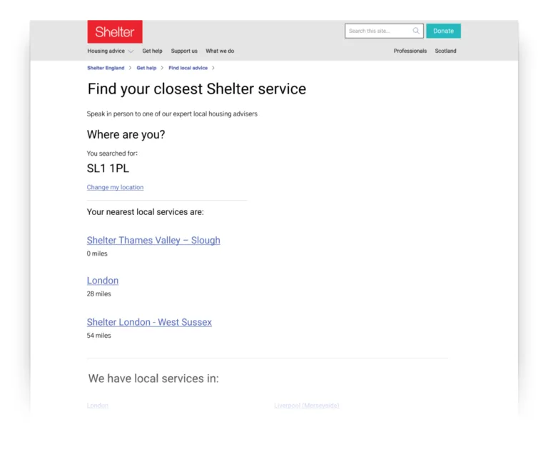
The search result of our Local Services pages’ second iteration
What we learned
G****etting t****o the core of the problems can help us spot opportunities to optimise services**.**
For example, understanding how we were updating information on the website led to rediscussing a costly contract with an external provider and ensured we now have consistently up-to-date information on our website
Always seek ways to make things simpler, even if that’s challenging.
We could’ve just redesigned the interface of these pages and our stakeholders would’ve been happy. But instead, we spent a considerable amount of effort to simplify the naming convention for our local services. A project like this was a one-off opportunity and the value it generated to both people in need and internal staff was worth the risk, and worth putting the extra work in.
Engage as soon as possible with stakeholders.
The process could’ve taken much less time if we‘d included the key decision makers earlier in the process, instead of working in isolation and presenting our findings and proposals back. Stakeholders will understand users’ struggles and needs better if they’re involved in the research and – as they’re the actual domain experts – will be incredibly resourceful when designing the solution together.