Creating focus using design sprints at Shelter
Published: by Caylee Farndon-Taylor
At Shelter, we fight for people’s right to a safe home. This could mean us providing legal representation against someone’s eviction in court, providing one-to-one advice via our helpline or hubs, or lobbying the government against estate agent fees, which we successfully managed to ban last summer ✊🏽.
UX time is shared across all parts of Shelter, whether that be campaigns, services, or fundraising, each with different priorities and deadlines. This means it can sometimes be quite hard to balance competing needs; especially when a project requires strategic, design thinking.
A recent project with our digital advice team allowed us to explore a method for creating focus in a short space of time_._ Instead of spending months failing to find time to do meaningful UX work, we blocked out our diaries for one week to see what we’d be able to achieve. We wanted to explore how we might make long-form content easier for our users to engage with. Because this is a wide-subject area and most of the team hadn’t worked together before, we thought it would be useful to follow a strict model for ideation, so we selected the GV Design Sprint. In this article I’m going to map out some of the insights we learnt along the way.
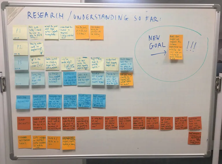
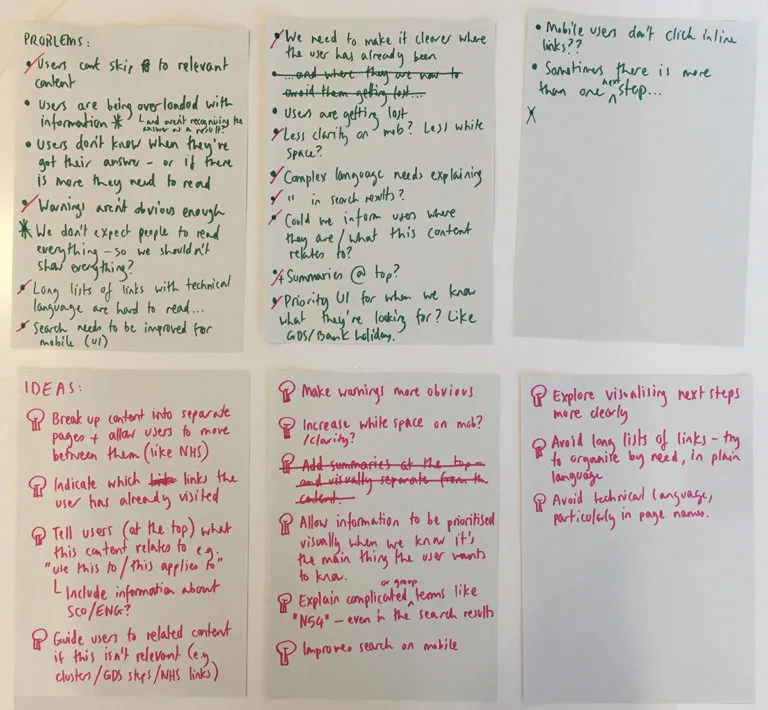
We began by exploring the problems and illustrating where these sit on our user journey. We reviewed some of the research and insights we already knew by:
- watching recordings of qualitative research, where users had been given tasks to perform on our Rent Increases page
- analysing user journeys on Shelter’s housing advice web pages via Hotjar
- discussing insights with other Housing Advisers
- reviewing Shelter’s customer survey data
Most facilitation guidance will encourage everyone to physically sit together when ideating like this. What you actually need is for everyone involved to be completely focused together; if you achieve this then having your team split across multiple locations shouldn’t be a problem. Complete focus means cancelling all other meetings, setting up out-of-office emails detailing availability, and leaving phones in our bags. By doing this we were able to run this sprint with seven designers, content designers, and researchers collaboratively working together across Edinburgh, Glasgow, Sheffield, and London.
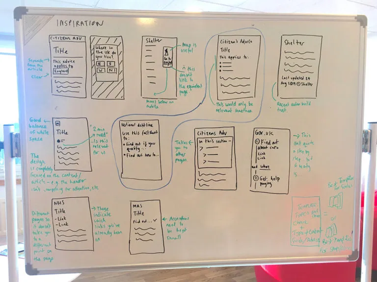
On the second morning we began by running lightning demos of relevant design patterns used by Shelter and other organisations. We then started ideating based on the problems that we had discovered the day before; initially listing the key problems and then writing down initial ideas for solutions.
These were then developed using Crazy 8s and storyboarding. We used coloured dots to create a visual ‘heatmap’ of the ideas that we most liked. Up until now the team had mostly been drawing on paper and sharing their work by posting photos in a Slack group we had made for the sprint. At this point we switched to Miro; which is a tool that allows you to collaboratively work on the same document, and has pre-made patterns such as digital sticky notes that you can use to document your thinking.
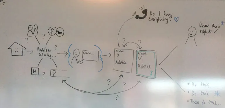
One issue that had been coming up a lot was that the housing advice team didn’t always know which design patterns to use and when. Housing advice articles might require different actions from the user, for example you might need to read through everything initially, or it might be essential that you perform a certain step before you do anything else. We decided to focus on this problem, and set about grouping the different types of content that we commonly create at Shelter.
These included:
- content where the user has one main CTA e.g. discretionary housing payments
- content where the user has lots of possible actions e.g. when your tenancy ends
- content where the user needs to perform multiple actions in order e.g. how to deal with mortgage arrears
- content where there is a lot of information to read through e.g. tenancy deposit protection rules
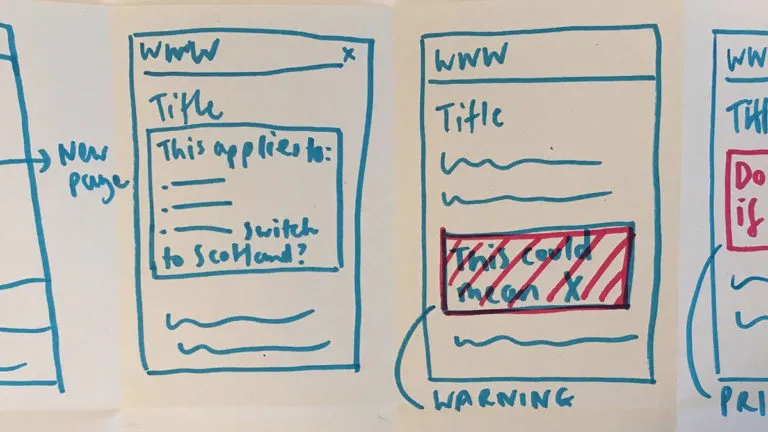
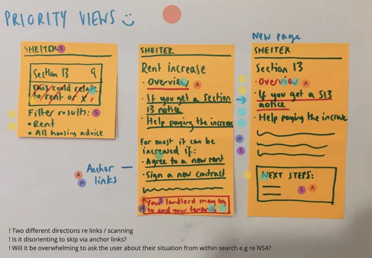
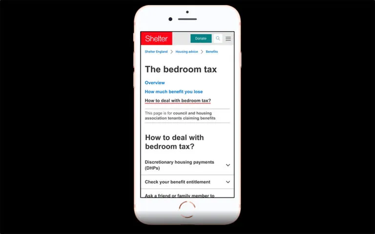
If we could help standardise what to use and when then we thought it would help the housing advice team know how to present content, as well as improving the experience for users navigating that content. It would also provide a clearer framework for us to test engagement and performance. We decided to explore this by developing a design ‘template’ for the second group, looking specifically at Shelter’s housing advice for how to deal with the bedroom tax.
We prototyped some early design improvements including;
- breaking up the content so that it was easier to navigate
- making warnings clearer to the user
- using larger typefaces and increasing the white space
- explaining more clearly who the content was relevant for
- creating clearer link states
We then tested this out with five participants, who were generally less overwhelmed by the amount of information presented in the new designs compared to what we had witnessed in our previous research. Our next step for this piece of work is to continue to explore design templates for all four content groups and to adapt our design patterns accordingly.
Time is precious. Design sprints are great because they allow you to explore a lot within a short space of time, and if at the end of that period you haven’t achieved much then it’s OK because you’ve only lost a week. We could have tried to spread this work out by contributing a few hours here and there over a few months and we wouldn’t have been able to achieve half of what we did.
We’re so used to being ‘on call’. Be it via WhatsApp, or Slack, or email it can be hard to even notice when we’re getting distracted. Next time you have some work that keeps getting put off; pause. Try to work out how much time you do have, be it an afternoon, a day or a week and block everything else out so you can focus on just that one thing.
If you’d like to be a part of the work we’re doing at Shelter, we’re currently hiring in both Sheffield and London. Come help us be the change you want to see in the world;
This post originally appeared on Caylee Farndon-Taylor’s blog.