Rebranding Shelter: a UX Designer’s perspective
Published: by Caylee Farndon-Taylor
Over the last year one of the key projects I’ve been working on at Shelter is the new brand, and how to realise it for digital.
This work began with a long-term research project into how the public sees us and the work we do. What we found was that while homelessness and issues around housing have become more important than ever, the public don’t see Shelter as being vocal or disruptive enough to meet the challenge. Our new brand was built to change that; to give Shelter the visual tools to be able to shout when it needs to. In this article I’ll talk about how we approached this project, and some of the things we learnt along the way.
We worked with the creative agency SuperUnion who created our new logo and graphical assets made up of activist-inspired brushstrokes
Lesson #1: start with your design system
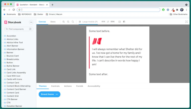
Before this work began we had already started to architect our own UI kit in Figma, and corresponding design system in storybook. Having this foundation was invaluable because it allowed us to easily visualise all the components that make up our digital platform, and reflect on what changes were needed in response to the new brand.
A screenshot taken from our rebranded UI kit library in Figma
We collaborated with product to define what global changes needed to be prioritised first. Once these were built we were then able to focus on the most important components (based on how often they were used, or how much change was required). This meant we didn’t have to try to ‘reskin’ every single page on the website.
The global changes we prioritised first included:
- Applying the new logo
- Adopting the new font, and creating rules for font sizes, line-heights and styling
- Creating and applying a new colour palette
- Redesigning our key navigational components including the website header and footer
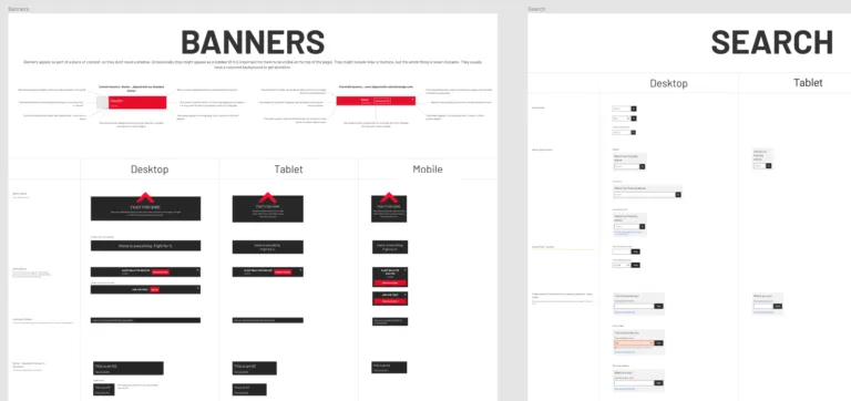
We created a brand theme in storybook which made demoing and testing the changes much easier. It also meant that when it came to launch it was just a case of turning off the standard styling theme and switching over to the new one.
Screenshot of our standard quotation component with the brand theme applied in Storybook
Lesson #2: the right font can look nice, and it can also improve legibility
The most common reason a user would come to the Shelter website is to get help with a housing issue; often by reading our advice content. Therefore we needed to be sure that any changes we made to our digital fonts wouldn’t negatively impact our users. We partnered with the user researcher Andy Parker to run comparative tests between our old font (Proxima Nova) and proposed font (Barlow).
Andy and I decided to compare the fonts by carrying out unmoderated and moderated research using an ‘opticians test’. This assessed individual preferences of what was easier to read, and/or visually pleasing to them and measured the actual time to read the article vs. their perceived time spent. We recruited users in task using Ethnio because we expected that being under housing stress might impact reading speeds and competency.
In our hypothesis we determined that a positive outcome would be if there was no change, or negative perception from changing the font. However in reality we found that Barlow performed better, as well as looking nicer. While the time spent on reading was roughly the same for both fonts, there were general perceptions that the page rendered in Barlow was easier to read, or felt like there was more space. Some participants even believed that there were fewer words to the sentences (when in reality all we had changed was the fonts and the line heights).
“Maybe it is the spacing between the words, or the font is different. But [Barlow] feels easier to read” — Shelter service user
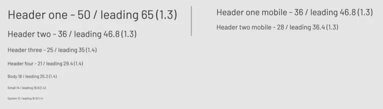
Font hierarchies, sizes, and line heights for Digital
Lesson #3: Make sure that your digital team is in the room from the beginning
Shelter is a big organisation, and our Digital team is relatively small. When the creative agency first pitched the colours for the new brand there was no one from Digital present, and several of the colours didn’t meet AA contrast requirements for text.
We decided to redo the colours in-house, but at this point Shelter was already committed to a very minimal palette, which was essentially just black, white and a new shade of red (with a contrast ratio of 3.98:1). A lot of time was spent working with our colleagues in Creative, aligning on colours that would work for both print and digital. In the end we also made the case that we needed a larger digital-only colour palette that would allow us to use a wider range of colours for things like success states and text links.
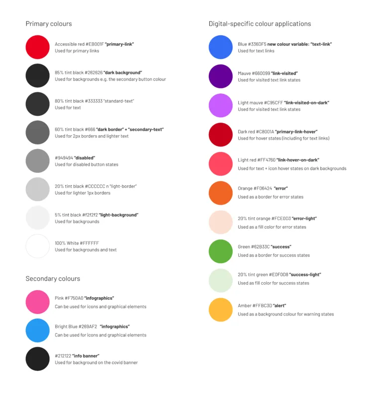
Primary and digital-specific colour palette
One concern that some of our service colleagues raised was that expanding our use of red across the website might increase stress for those users looking for help and advice. We resolved this by limiting the use of the red to just priority items, and creating new primary and secondary CTAs. This solution also mapped to the needs of the brand team, who were keen for the red to not be overused.
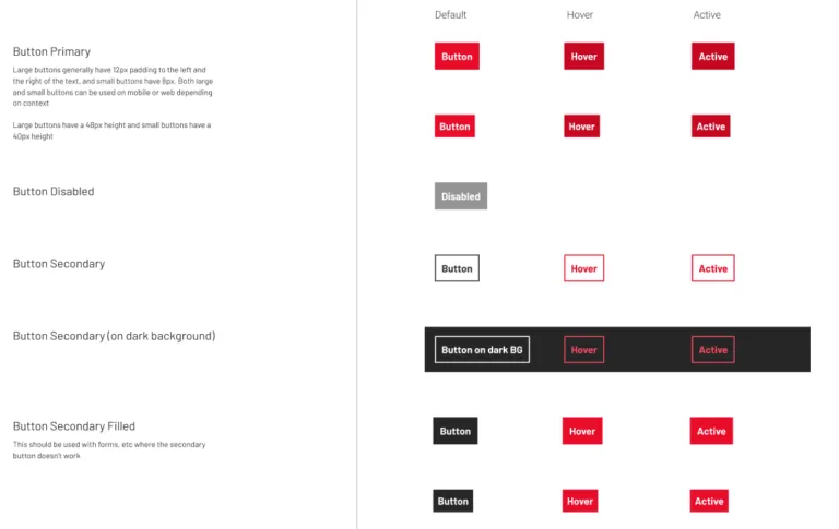
Primary and secondary buttons and states
Learning #4: Take the time to build understanding of digital best practice across your organisation
This is the first rebranding exercise that Shelter has done in a decade, so there were a lot of stakeholders that were invested in it being perfect. At times it felt like I was spending more time explaining my decision-making than actually doing the work. Had we all had more understanding of each other’s disciplines before this project started then things may have progressed a lot faster. However because we took the time to build understanding during this project, we are now in a stronger position to collaborate across different teams in the future.
One of the things we spent a lot of our time on was ensuring that all of the brand work was accessible, even by teams who wouldn’t normally consider this to be their responsibility. Throughout this project we were able to challenge those assumptions and educate the wider organisation about how to design inclusively. We have also now set up an accessibility community of practice which a number of non-Digital colleagues have joined.
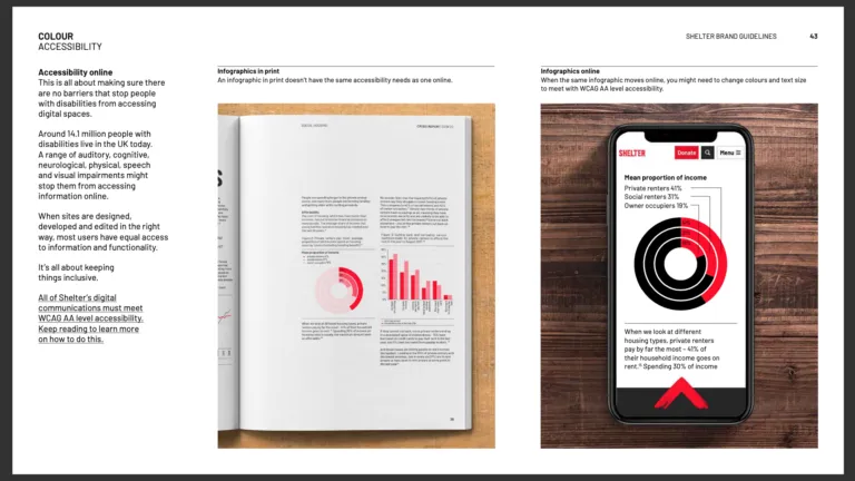
This is a screenshot from the brand guidelines produced by Creative, who we spent a lot of time working with to build understanding of accessibility best practices for digital infographics and colour
Learning #5: Own the UX of your whole site
We conducted regular qualitative user research on our designs for rebrand using the Userlytics platform. Because this often meant testing a rebranded version of our whole website, the insights we got were sometimes related to non-brand issues.
For example one usability issue we discovered was that users had very little comprehension that Shelter has both a Scotland site and an England site. This site split is required because housing advice is different in these two countries, so if a user ends up on the wrong site they could be getting the wrong information. To try to improve this we designed a more obvious region toggle for our rebranded header pattern, which was distinctive to the other links, and explained the difference between the two sites when you switched. There were other usability issues that we found that we weren’t able to prioritise and fix within our brand work, but we were able to pass on the insights to other product teams to take on.
Working in small, cross-discipline product teams is great, because you generally get to completely own one part of the digital estate. However it’s easy to get tunnel vision and miss usability issues that are affecting the global experience, rather than just your bit. The brand project reminded us how important it is to do regular, holistic research into the whole experience, to ensure that the organisation is focussing on the most important problems.
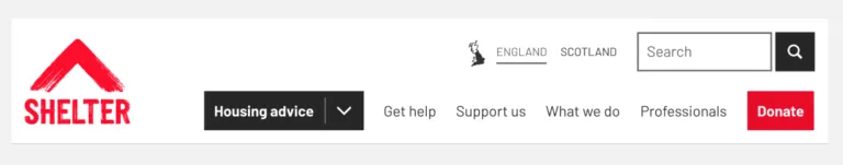
Shelter’s new header pattern for desktop, with the region toggle included
Conclusion
Shelter has now launched its new brand, however we will continue to review and iterate based on the feedback and data we collect over the next few months. I hope that some of the lessons I’ve listed here might be useful if you ever do a similar piece of work.
This is the first time I have worked on such a large-scale brand project, and it has been so rewarding seeing all the connecting parts come together for the launch; from our rebranded digital products, to the billboard and poster campaigns, to our new shop windows all across the country. The fight for home starts here.
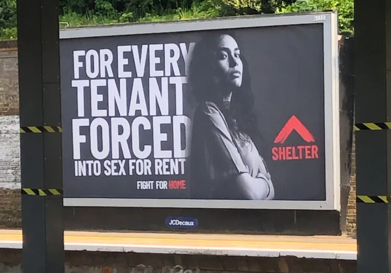
Photo of a Shelter billboard at Denmark Hill station; taken by Gabriella Okon