How we got our advisers to answer more emergency helpline calls
Published: by Matteo Remondini

As a service delivery organisation, we face constant demand pressure on our already overstretched services. This isn’t going to change any time soon – so it’s essential we optimise and improve the way our clients engage with our services.
Previously, we talked about redefining what ‘urgency’ means to different people, and how it could impact their experience of using our housing helpline service. We introduced our emergency helpline number, which gives service users the option to decide how important their issue is, and prioritises urgent calls in our telephone queue.
This was so successful that we wanted to experiment with other ways to optimise the performance of our emergency helpline service. As with our experiments so far, we had two main aims:
- i****ncreasing the number of urgent calls that are able to reach us
- r****educing the overall volume of calls we receive to our already strained services
Helping our users reach the right service
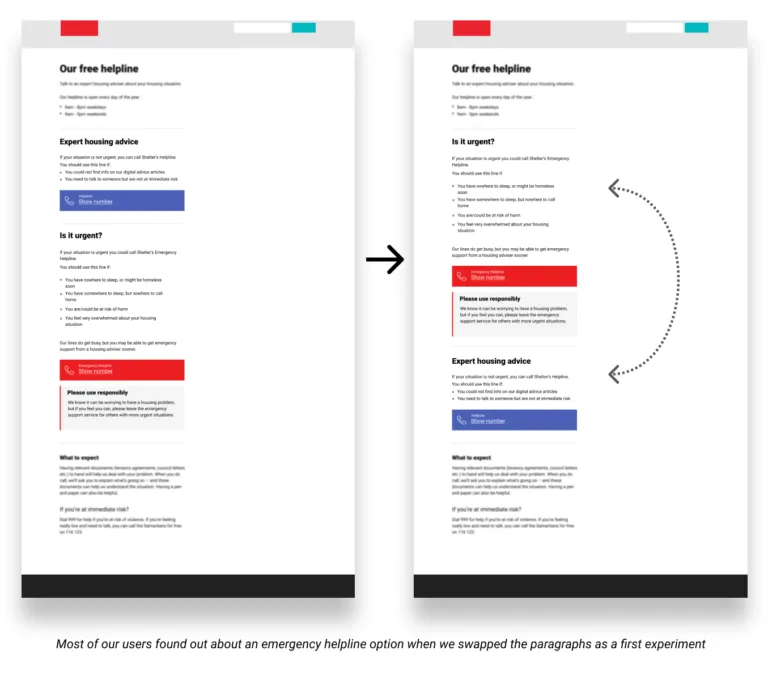
Looking at user testing, we found that some users may not scroll down the page far enough to see the emergency line number, meaning our most vulnerable clients were calling our regular helpline instead.
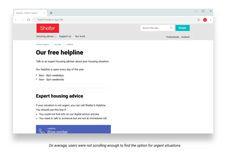
To address this, we decided to test moving the emergency number above the regular number on the helpline page, to see how this changed people’s behavior. Knowing there was a risk non-urgent calls may come via the emergency line, we closely monitored the service to see if the ratio between the emergency and non-urgent calls was affected.
Giving more visibility to the emergency helpline increased the number of calls to this number, with the ratio of urgent to non-urgent calls remaining unchanged. This was a positive outcome, because an overall increase meant an increase in urgent calls – meaning more users in need of urgent help were able to reach us.
Reducing demand by m****anaging expectations
We then explored whether being upfront about the demand on our helpline would encourage people to find answers through other channels. We used a short disclaimer message, which was transparent around the limited resources available. This made it clear that people may not get into the call queue immediately – and once they did, they may have had to wait on hold.
We didn’t want to create a barrier for people trying to access our service, and knew that only people who found our number via the website would see the message.
Adding a disclaimer paragraph decreased the number of calls to both the emergency and regular helpline numbers, without significantly impacting the ratio of appropriate calls.
Discouraging misuse of the system
When we initially set up our emergency helpline page, we made it clear on the page that by calling this number, service users would have a higher chance of getting through. We assumed that some people who did not have an urgent situation might take advantage of this easier access.
It seemed like a good opportunity to test this assumption, so we designed a layout that gives the regular helpline and emergency helpline numbers equal standing on the page – with the appropriate descriptions allowing users to choose based on the urgency criteria provided.
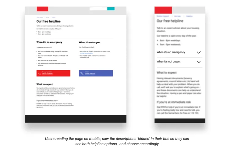
Removing the paragraph that suggested people might have a higher chance of getting through to the emergency helpline resulted in an increase in the percentage of all calls answered which were classed as urgent.
Making both helpline options clear and giving them equal importance on the page resulted in the number of emergency calls – as defined by our criteria – served by the helplines increasing significantly.
This was a good outcome, as it encouraged our users to behave in the way hoped they would – users with urgent need called the emergency line, while users with less urgent needs called the regular line.
Combining the most successful experiments
In our fourth and final experiment, we decided to combine the two most successful experiments, experiments two and three. We hypothesised that by giving the helplines equal weighting on the page, and removing the disclaimer paragraph, we might achieve the best result yet.
However, the results were mixed. Although overall calls to the emergency helpline increased, the impact on the ratio of emergency to non-emergency calls was not as positive as with experiment three alone. Because our ultimate goal was to achieve the highest ratio of emergency to non-emergency calls, we decided to use the format of experiment three as our final design for the page.
What we’ve learned
The four experiments had a marked impact on the behaviours we were hoping to influence, and represent a turning point in our approach. We now understand the optimal weighting of our two helplines on the page, as well as how best to communicate with the difference between them to users.
Taken together, these have resulted in a greater quantity of urgent calls served by our emergency helpline, and a higher ratio of urgent to non-urgent calls (up to 35%, an increase of about 12% from when we launched the first experiment). In real terms, this means thousands more people in urgent housing need can get through to an adviser to get vital support.
The elephant in the room…
In a way, the experiments have been too successful! The demand is starting to outstrip our regular helpline’s capacity, to the point where people calling the emergency helpline will have the same likelihood of speaking to an adviser as calling the normal number.
It hasn’t quite reached that stage – urgent callers are still nearly twice as likely to speak to someone. The challenge now is to see if there is a way we could increase the answer rate and help even more people.
For the future, we’re aiming for time when the majority of our regular helpline’s limited resource is used to help those who are in most urgent need.